8 preguntas que deberías hacerte para encontrar la tipografía perfecta para la portada de tu libro

Como diseñadora, encontrar una tipografía versátil y bonita que encaje perfectamente con el proyecto que tengo entre manos me hace sentir como un explorador en busca del Santo Grial. Puede que hayas decidido encargarte tú mismo del diseño de la portada de tu novela, o a lo mejor estás colaborando con un diseñador y ni siquiera sabes por dónde empezar. O has llegado al punto de frustración por no encontrar lo que encaja con tu historia. La verdad es que, si estás leyendo esta publicación, es muy probable que seas una de esas personas que no se conforman con cualquier tipografía. La primera opcion no te convencerá. Ni la segunda. No desesperes, ¡es algo bueno!
¿Cómo podemos hacer ese proceso más fácila? ¿Qué familias tipográficas podemos descartar? He escrito una serie de consejos y preguntas que deberías hacerte para que todo el proceso sea más llevadero y ayudarte a reducir tus opciones para (con suerte), encontrar la fuente perfecta para la portada de tu libro.
Lo primero que siempre recomiendo cuando se trata de preguntas sobre la portada de tu futuro libro es: ve a una librería. Es bastante sencillo, ¿verdad? También puedes buscar portadas de libros en la página web de las editoriales o explorar el hashtag #bookstagram en redes sociales. Pero, siendo sincero, nada iguala ir a una librería para llevar a cabo una buena investigación. Los libros suelen estar organizados por géneros, lo que facilita distinguir y aprender sobre los clichés y recursos que usan las portadas de las novelas según su género.
Seguramente te has encontrado frente a las estanterías de Thriller/Misterio y has notado la abundancia de portadas negras o de colores oscuros. O la explosión de colores alrededor de la sección de Fantasía/Ciencia Ficción. ¡Exacto! Las portadas siguen un patrón. No estoy aquí para debatir si los clichés de género son buenos o malos (de hecho, estaba pensando en escribir una publicación sobre eso...), pero de todas formas, es un buen punto de partida.
Comparto algunos consejos y preguntas que deberías hacerte para ayudarte a saber por dónde empezar:
01
¿A QUÉ GÉNERO PERTENECE TU LIBRO?
Puede haber más de uno, la verdad es que la mayoría de las novelas no encajan en un solo género. Eso probablemente hará que tu portada tenga más profunidad e identidad al compararla con otras novelas. Es un muy buen punto de partida observar qué elementos utilizan otros libros del mismo género (así como lo que NO usan). Además, es una oportunidad perfecta para encontrar qué elementos te gustan más y cuáles preferirías no utilizar. Observa y aprende de ellos.
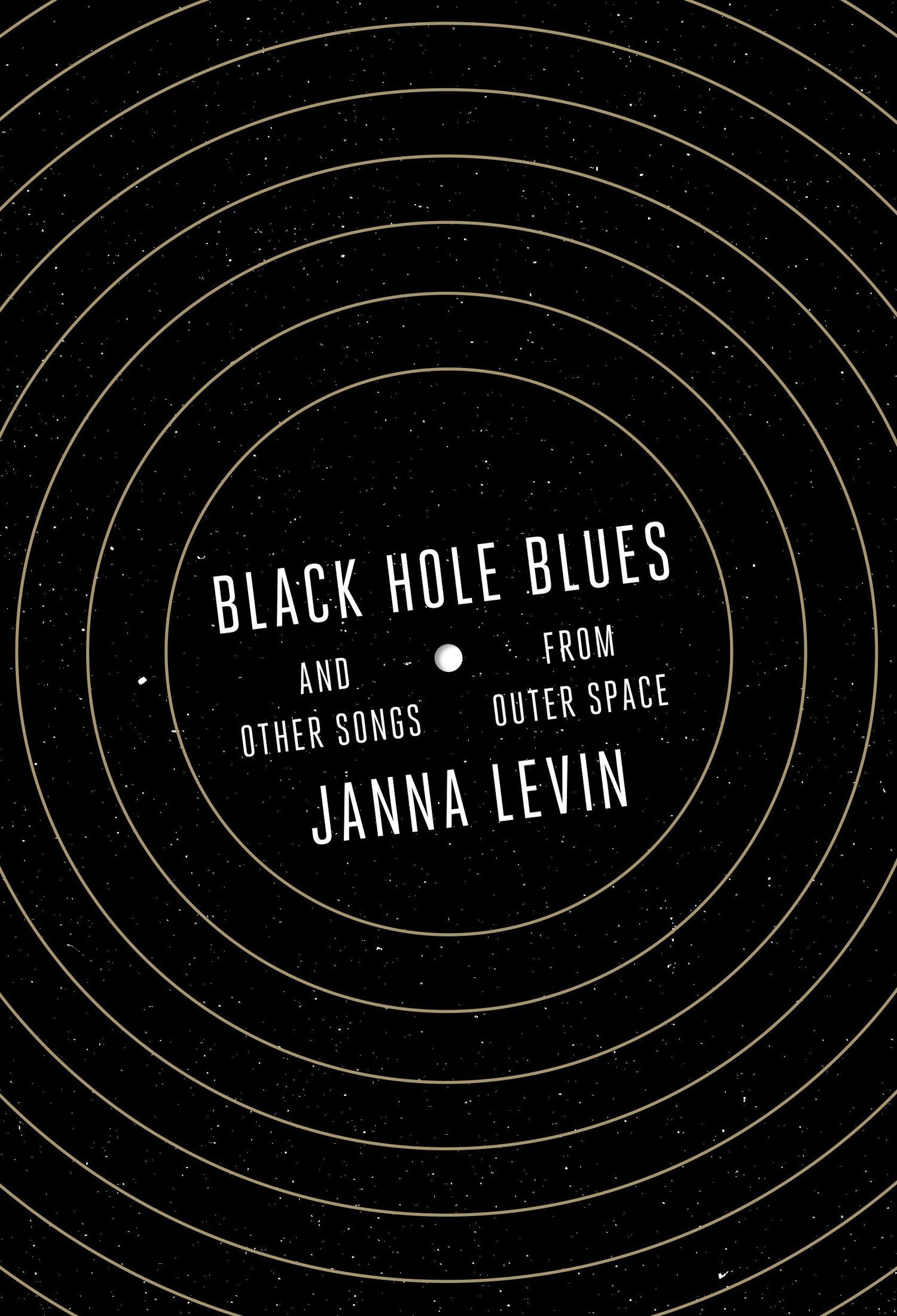
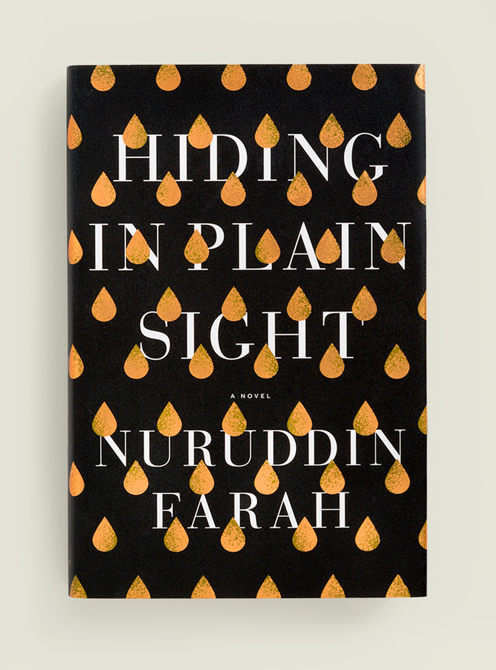
Por ejemplo, fíjate cómo la ciencia ficción suele usar fuentes delgadas, sin serifa, con trazos abiertos o espaciado amplio. Esos recursos pueden utilizarse para hacer referencia al vasto mundo y al espacio exterior. Luego, compara las estanterías de ciencia ficción con las ediciones de libros para niños. Tienden a usar tipografías más anchas y redondeadas, que generalmente están construidas con trazos cálidos y amigables.
02
¿QUÉ OTROS ELEMENTOS VAN A COEXISTIR CON TU TEXTO?
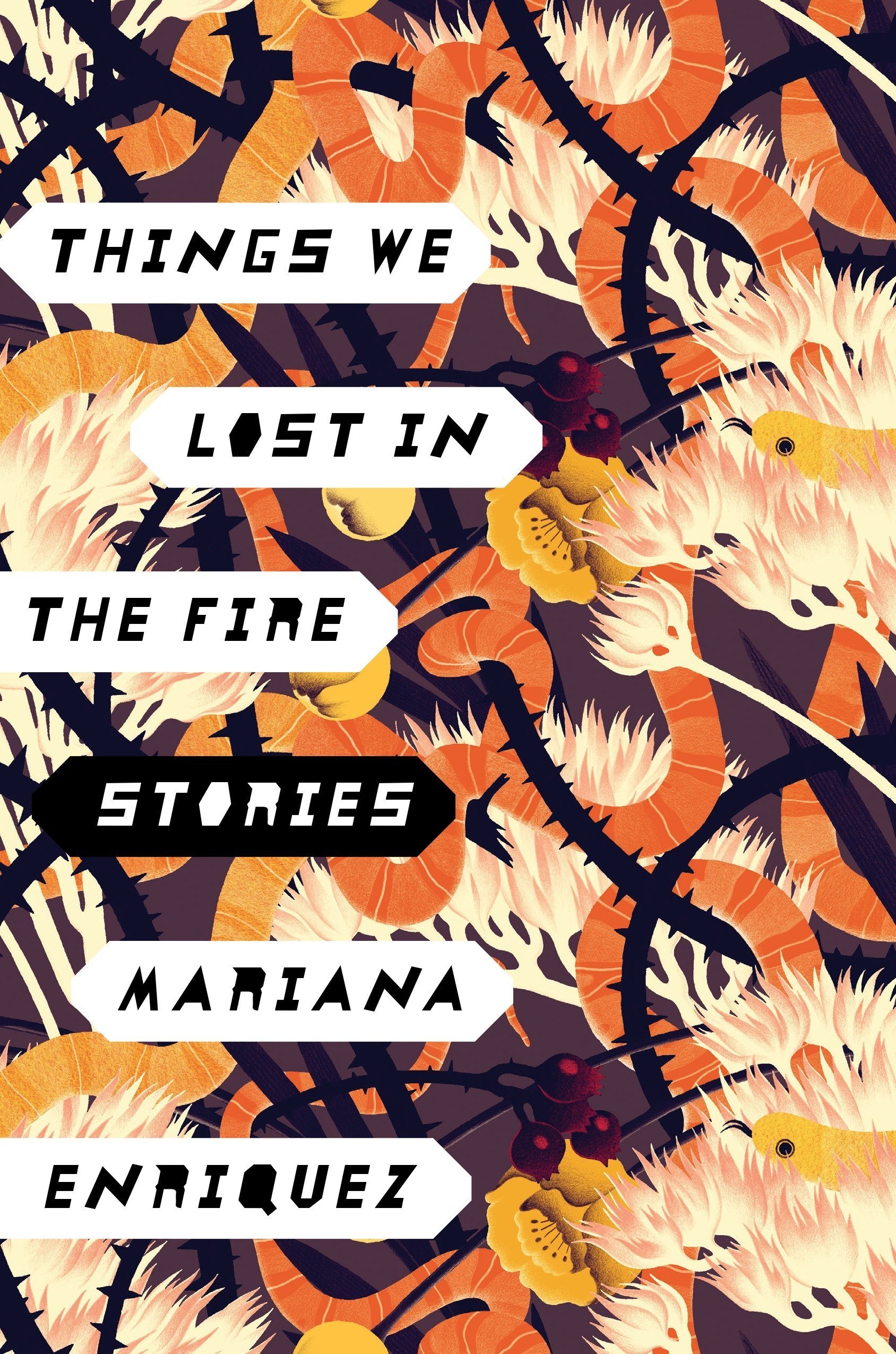
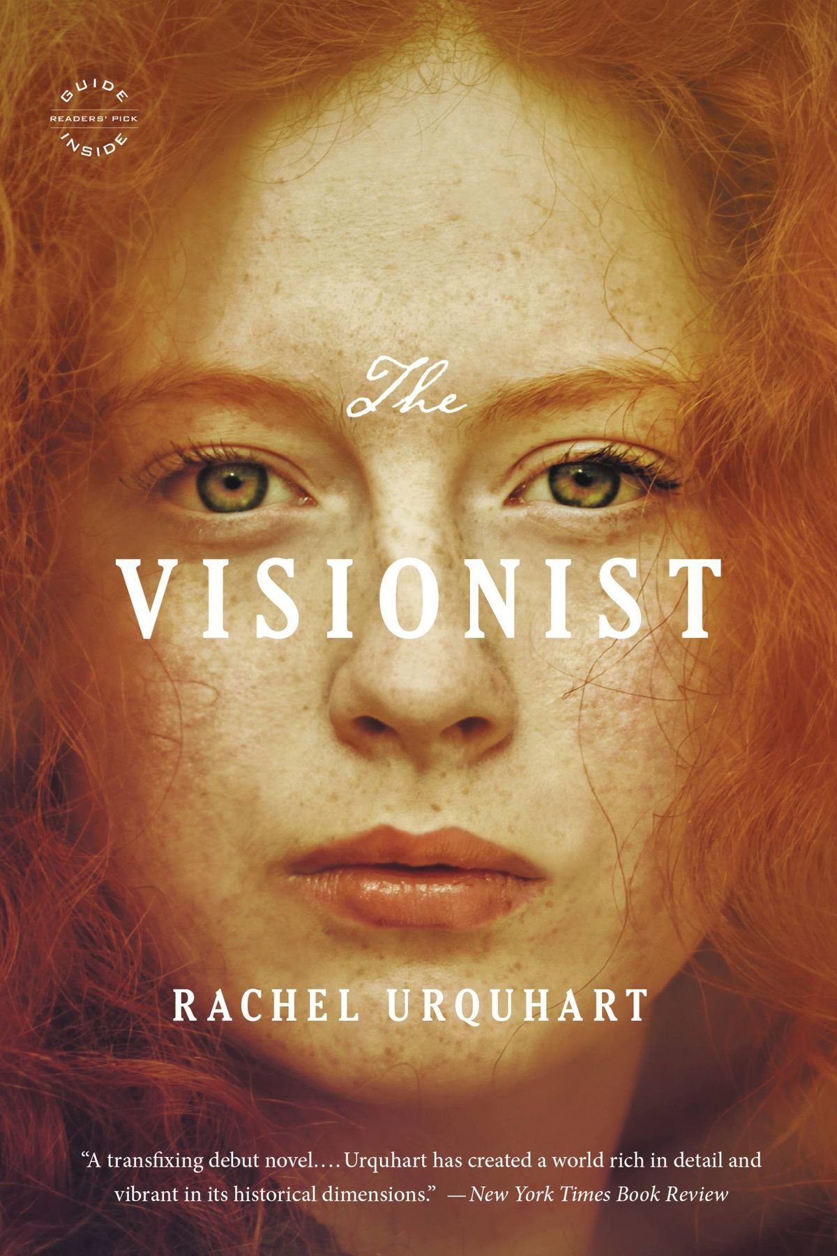
¿Fotografía? ¿Ilustración? ¿Un color plano? Tal vez haya varios elementos alrededor, o quizás haya mucho espacio en blanco por llenar. Estas son preguntas que debes hacerte para que el fondo y el título de tu portada se complementen y coexistan. Si el fondo es complejo, elegir una fuente delgada con muchos detalles puede no ser la mejor idea, ya que dificultará la lectura. En ese caso, elige fuentes sin serifas, sin contrastes exagerados en los trazos (¡adiós, Didonas!) y sin letras complejas. Si, por el contrario, tu fondo es amigable o tiene mucho espacio en blanco, entonces ¡adelante! Elige fuentes más arriesgadas: letterings, trazos delgados, grandes contrastes…
03
¿CÓMO DE LARGO ES EL TÍTULO Y EL NOMBRE Y APELLIDO DEL AUTOR?
Hay fuentes que fueron diseñadas para ser titulares y es difícil leerlas si el título es demasiado largo, por lo que debe hacerse más pequeño para que quepa en la portada. Lo último que quieres es que tus lectores no puedan reconocer el título de tu novela. Piensa en lo que sucederá cuando tu portada aparezca en un formato más pequeño, como en bibliotecas de ebooks o catálogos en línea.
Si, por el contrario, el título del libro y el nombre del autor son bastante cortos, puedes optar por tipografías más complejas o radicales. Lo importante aquí es facilitar la lectura, la legibilidad es clave.
04
¿DEBERÍA OPTAR POR LETTERING O UNA FUENTE MANUSCRITA?
¡Puede ser muy buena opción! Sin embargo, ten cuidado, debe ser adecuada para tu novela o género, y completamente legible. Algunas tipografías de lettering o manuscritas, dependiendo del título, pueden dificultar la lectura. Cuanto más intrincado sea el trabajo de lettering o caligrafía, más fácil será confundir las letras y terminar leyendo algo completamente diferente, que poco tiene que ver con el título de tu libro. Si el título es demasiado largo, puede resultar confuso: asegúrate de que siempre ayude a la legibilidad y le dé suficiente espacio para respirar, sin superponerse de manera molesta con otros elementos de la portada.
005
HOW DO I SEND A MESSAGE THROUGH TYPOGRAPHY?
The title and message of your novel are crucial, and the typeface you choose can say much more about it. Is it an introspective book? Is it a protest book? Typography can help strengthen the message of the title and the tone of your novel. The size of the typeface, as well as the character it conveys, can add a lot of information to the cover. Just by looking at it, you can communicate the message within its pages. It can be a quiet typeface, whispering. It can be ExtraBold and scream. It can be strange and bizarre or feel scary. Dare to use it to your advantage!
006
YOU DON’T WANT TO ADD MORE THAN 3 TYPEFACES TO YOUR MIX
As with any graphic project, typeface pairing is an art itself. Be careful and cautious when mixing typefaces for your cover and back cover. Antoine de Saint-Exupery once said: “A designer knows he has achieved perfection not when there is nothing left to add, but when there is nothing left to take away.”
Adding too many typefaces may confuse the reader, look unprofessional or not well-cared enough. So that’s a total no! Most covers work with one or, ideally, two typefaces paired together.
007
RUN FROM THESE TYPEFACES
I’m not even kidding here. Run. Do some research before settling on your choice. There are some typefaces in the design world that are, literally, meme material. I’m looking at you, Comic Sans and Papyrus. Avoid them at all costs. Some other typefaces, mostly handwritten or serif fonts, look too naive and unprofessional to use on a book cover, and they will make your book look like so. They will cheap your work and we don’t want that!

008
BE AWARE OF MARKET TRENDS & CHOOSE WISELY IF YOU WANT TO FOLLOW THEM
My last recommendation when looking for the perfect typeface for your novel is to refrain from turning a deaf ear to your story and genre and letting yourself be influenced by the flashy trend of the moment. A few years ago, all of a sudden, every new release used lettering. That’s what trends do! They oversaturate the market. Choose wisely if that trend is working for you or against your work and target. Trends will expire. Take a sec to focus on your story and the reader it is targeted to, and you’ll be fine. Your book will give you the answers you seek.
I hope these questions and tips helped you get a clearer idea of where to start. Feel free to check my other resources about Self-Publishing and Book Cover Design. If you still feel lost about your path of bringing to life the book cover of your dreams, do not hesitate to reach me! I also offer one-to-one consultations, so if that is something you’d be interested in, drop me an email or contact me through our client application form!
